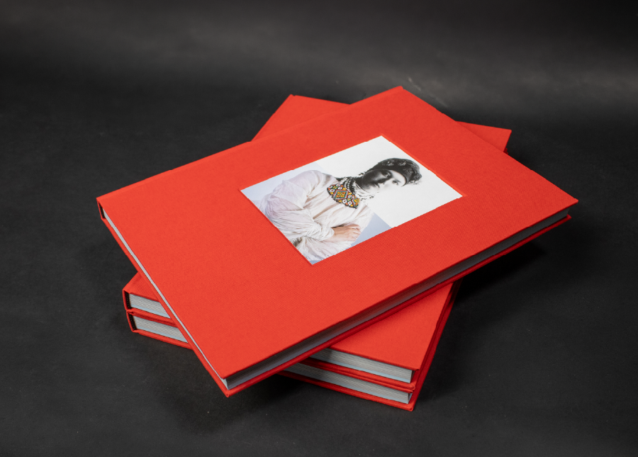
Uncle frank

2025

poster

Uncle Franc

The poster was made during an information design course, where we were tasked with gathering a large amount of information and making an information poster so that we could understand what the film was about based on the poster and date.

Bias by us

2025

editorial

Bias by us

Bias by Us is an editorial design project developed during a third-year editorial design course. The task was to create a book based on a self-selected theme, combining research, content structuring, and visual storytelling. The project explores 
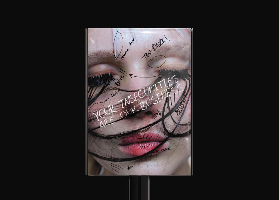
different types of cognitive distortions and biases that we encounter in everyday life. A particular focus was placed on beliefs and assumptions related to predictions, such as tarot reading, astrology, fortune-telling, and similar practices, as well as on how people emotionally and cognitively react to news 
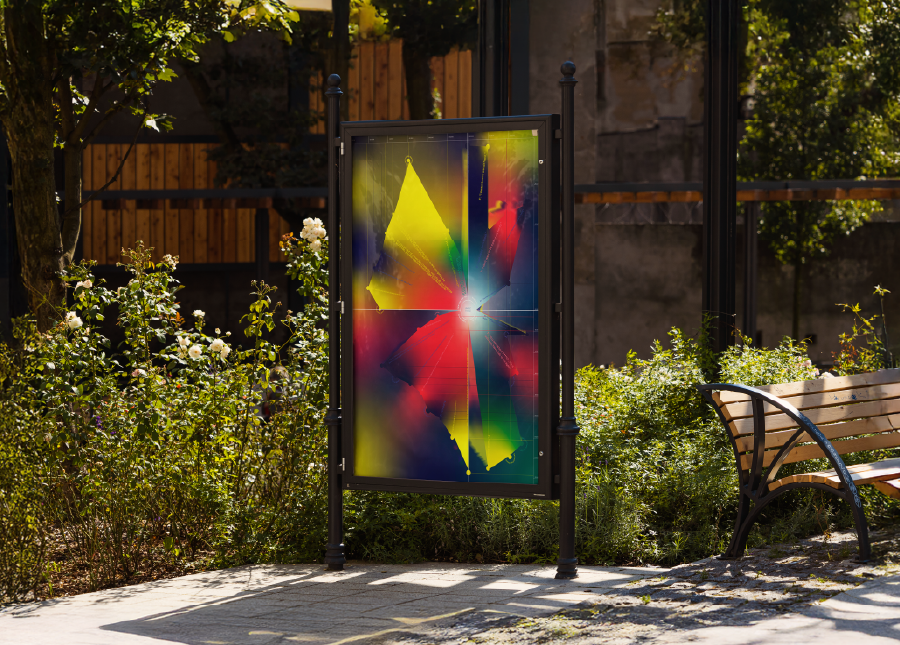
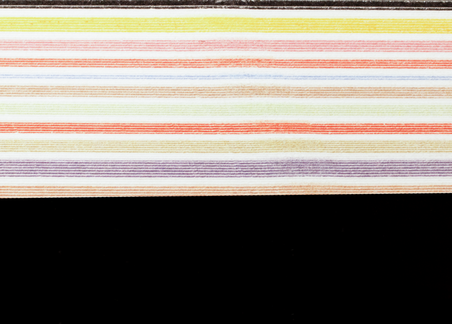
and information. I selected ten types of bias, assigning a distinct color to each one in order to create a clear visual 
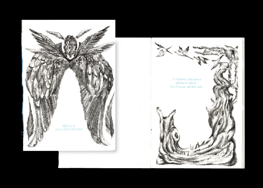
system and help differentiate the chapters. In addition to 
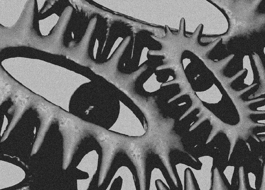
explanatory text, each section concludes with a small illustrated comic, designed to simplify complex ideas and provide an intuitive, relatable interpretation of the topic. 
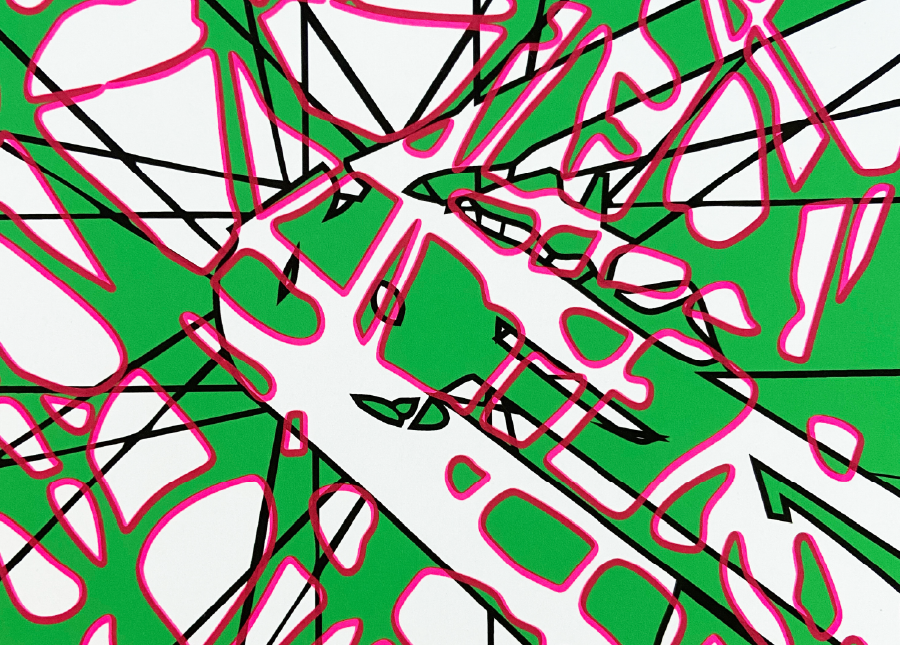
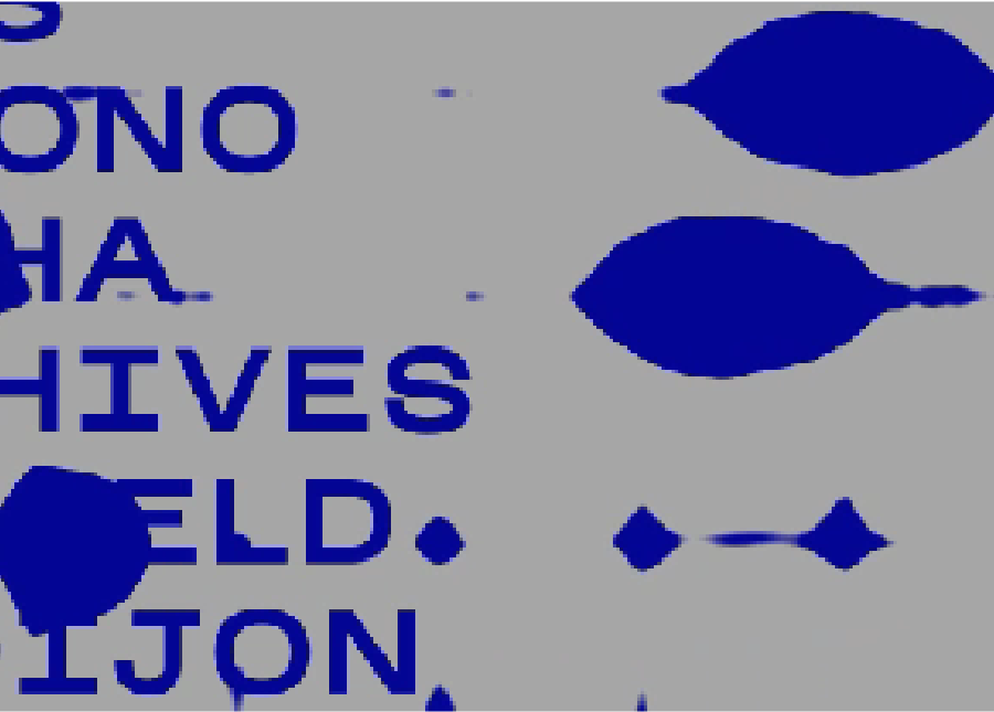
Typography plays an active role in the book: certain texts are intentionally distorted, reflecting the nature of bias itself and creating a dynamic, engaging reading experience. Through the combination of research, color coding, illustration, and experimental typography, the book aims to visually communicate how perception can be shaped, altered, and manipulated.

Mosaic of diversity

2024

identity

Mosaic of diversity

Mosaic of Diversity is a group visual identity project developed during the second year of graphic design studies at ECAL, as part of the Visual Identity course. Over the course of one semester, I worked together with Unasit Korakot on a branding concept for the AntiGel Festival in Geneva. The project uses pixel-based visuals to create dynamic animations that convey movement and energy. The pixels form shifting compositions, symbolizing the constant flow of the festival and the people who come together to shape AntiGel itself. Bright, saturated colors were chosen to express intensity, diversity, and strong emotional experiences, reflecting the vibrant atmosphere of the festival.

TURN!

2025

poster

TURN!

This poster was created during a workshop with Balmer Hählen and is based on a personal memory. My chosen moment recalls the first time I rode a bicycle, when I was unable to stop and crashed into a tree. The poster translates this experience into a visual narrative, focusing on the feeling of impact and sudden interruption. In the second stage of the workshop, shared elements and a common color system were introduced to connect all posters into a collective series. Green was used as the base color, with a pink layer printed on top using screen printing. The pattern represents the idea of being stuck — both physically and mentally — reflecting how certain memories remain imprinted in the mind.

Wings by Lina Kostenko

2025

editorial, litographie

Wings

The project is dedicated to the poem "Wings" by the Ukrainian author Lina Kostenko. The project was done using lithography, or stone drawing and printing. Having made a system of a book of pictures, which follows the story of the verse, in order to convey the feeling, there is something for everyone, and to strengthen it with the material and the way of carrying out this project.

Nuclear War be damned

2024

3D

Nuclear War be damned

In this project, I was inspired by the work of Maria Prymencheno, Nuclear War be damned, taking a picture in the style of primitivism, I tried to convey and tear the picture into three separate components. Nuclear war, anxiety and, of course, the main creature, combined everything in one composition.

categories all
identity editorial posters motion 3D